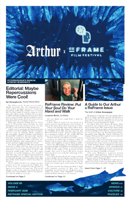


.png)


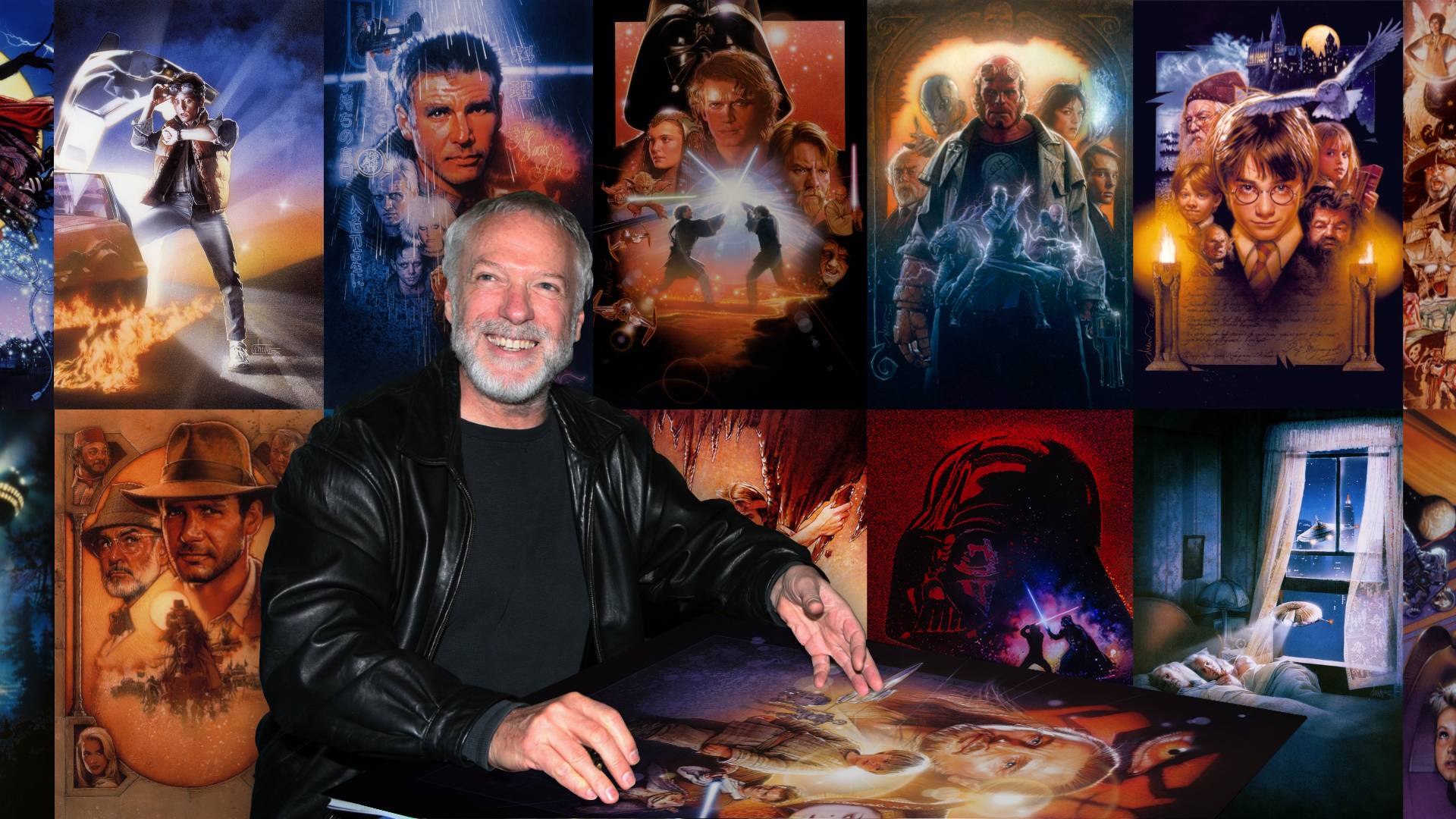
On October 13th, 2025, famous illustrator and poster artist Drew Struzan passed away from Alzheimer’s at the age of 78. Drew was a true legend of pop culture imagery and painted over 150 movie posters over the course of his career, including those for The Goonies, Blade Runner, and Shawshank Redemption, along with advertising for a variety of notable franchises from Star Wars and The Muppets to Police Academy.
The details of his Alzheimer’s diagnosis were kept private until his wife Dylan came to Instagram in March of this year to announce that after several years of suffering from this debilitating disease, he was “no longer [able to paint] or sign things for [fans].” In this message, she emphasized Drew’s “strong legacy of love and joy in the form of his work,” while also providing a comprehensive explanation of the cognitive and physical decline associated with Alzheimer’s.
Born in Oregon City, Oregon on March 18th, 1947 and raised near San José, California, Struzan was “draw[ing] before he could talk.” Coming from a low-income family, the only available “canvas” in the house was toilet paper, which he would draw on before rolling back up. (All unattributed quotes are retrieved from Erik Sharkey’s 2013 documentary Drew: The Man Behind the Poster.)
Drew began studying illustration at the Art Center College of Design in Pasadena, California in 1965. There he became interested in Modernist and Impressionist artwork, with their respective experimental techniques and vibrant colour palettes that heavily influenced his own artistic style. In order to afford tuition, he sold his coursework paintings to other students. He was still often kicked out of class by counsellors and accountants for overdue payments, but would sneak back in through the back door, as he “didn’t want to miss any of [his] education.” He and Dylan welcomed their son Christian in 1968, making their finances even tighter.
About a year after graduating, Drew started working at Pacific Eye and Ear design agency in Los Angeles, creating album covers for the likes of Carole King, the Bee Gees, Roy Orbison, Jefferson Airplane, Earth, Wind, & Fire, and Alice Cooper.
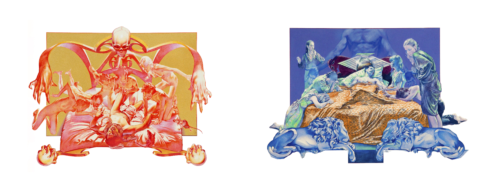
In his cover art for Black Sabbath’s 1973 album Sabbath Bloody Sabbath, he employed one of his signature composition techniques of positioning two polar opposites beside one another. Both sides of the record show a man on the verge of death, each facing visibly different fates. Funnily enough, the man portrayed on both sides is actually a 26 year-old Drew.
He creates this dichotomy of good and evil through contrasting warm and cool colour schemes, and imagery surrounding heaven and hell. One of my personal favourite aspects of this piece is the downward motion of the man, skull, and demons on the front side that directly contrasts the upwards, transcendent direction of the back cover, further implying their respective trajectories.
In 1975, a billboard of Struzan’s artwork for Alice Cooper’s Welcome to My Nightmare caught the eye of an art director at Seiniger Advertising, which led to Tony Seiniger, the company’s owner, calling Drew the very next day to offer him a job making movie posters. It provided an exponentially higher paygrade than Pacific Eye and Ear, and now that his work was gaining attention, he felt comfortable leaving the design studio to create a name for himself.
The first poster he did for Seiniger was for Blackbird in that same year, with their partnership concluding amicably 16 years later after collaborating on a poster for Steven Speilberg’s Hook in 1991.
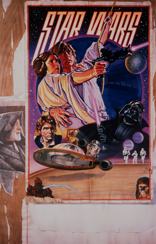
Drew’s rise to fame in popular culture came when Charlie White III, a seasoned poster artist, approached him to collaborate on the re-release poster for Star Wars: A New Hope in the summer of 1977. Charlie had already designed the layout and lettering for the piece, but struggled with portraits, hence his request for Drew’s stylistic realism.
“I said ‘I’ll do it on one condition: that I get to watch you paint some of your part in airbrush,’” Drew explained. “I’d never seen an airbrush in my life, so I wanted to see how he did it, being the master of it.”
The poster was finished in just over a week, with Charlie’s portions completed in dyes and airbrush and Drew’s done in oil paint—his primary technique at the time. After sending their copy to Lucasfilm for approval, they received feedback that the composition didn’t allot enough space for billing and credits. Rather than restart on a larger piece of paper, the pair opted for making a wild-posting effect through layering in order to create a larger block of empty space.
The Star Wars “Circus Poster” is an incredibly unique piece in its offset focal point and combination of different mediums. The illusion of the “original” poster being plastered outside functions as an homage to marketing history, with similarly vibrant circus posters being some of the first mass-produced advertising materials.
This project also prompted Struzan’s switch from oils to acrylic paints, often applied with an airbrush to reduce the texture created by brushstrokes. This method, mixed with the use of coloured pencils, provided a faster drying time and allowed him to easily make changes based on the studio’s notes by simply painting over areas of his work with a layer of acrylic.
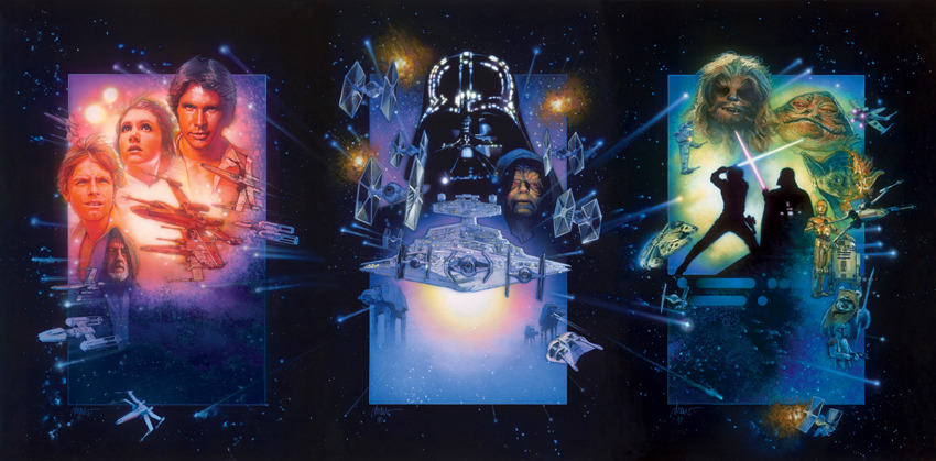
In addition to illustrating a teaser poster for Return of the Jedi, and the posters for all three prequel films (The Phantom Menace, Attack of the Clones, and Revenge of the Sith), Drew created a triptych—“three posters that work together as one”—for a special edition rerelease of the original trilogy in 1997.
When he received a call on Christmas Eve in 1996 from George Lucas requesting that he create a poster for the special edition trilogy, Drew was staggered that they wanted a single poster for a three-film release, saying that “[they were] blowing a really grand opportunity to do a triptych.” He came up with the design for all three posters while still on the phone, began painting the first third of the collection, and sent it off to Lucasfilm.
“They picked it up and carried it away and now I realize that [for] the second one I have to match the colour, the intensity, and the design to the first one,” Drew said. “But I don’t have it here! So I had to do it from memory, and the same thing happened for the third one.”
“The triptych was designed on the telephone, painted without any drawing or comp[rehensive layout] or design, and I had to match three paintings to each other without seeing the other two at the same time,” he continued.
When paired with the prequel posters, this epic six-poster collection masterfully and cohesively encapsulates the entire Star Wars saga, with each piece following the same frame-based design—another one of Drew’s signature compositions.
On October 14th, Lucasfilm published a heartfelt tribute to Drew, which included a statement from Lucas reflecting on Drew’s legacy.
“Drew was an artist of the highest order,” he wrote. “His illustrations fully captured the excitement, tone and spirit of each of my films his artwork represented. His creativity, through a single illustrated image, opened up a world full of life in vivid color…even at a glance. I was lucky to have worked with him time and time again.”
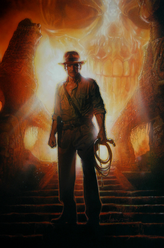
Struzan’s work for Lucasfilm didn’t stop at Star Wars: he was also responsible for most of the promotional materials for the first four Indiana Jones movies. Despite the iconicity of these film posters, Drew’s contribution to the franchise is best represented by the advance poster for Indiana Jones and the Kingdom of the Crystal Skull.
This piece demonstrates his ability to tell an audience so much about a character through a still image, capturing a sense of adventure and intrigue while signifying Indy’s long-awaited return to the silver screen. Drew enjoyed illustrating “simplified, iconic figures that emphasize their heroism, or their beauty, or whatever main characteristics they have,” and this piece is a perfect depiction of his strength in achieving exactly that.
“He gave [Indy] a nobility and heroic character, and frankly he made me look good,” Harrison Ford said of Struzan’s portraits of him. “It looks like me, but it’s invested with the nature and character of Indiana Jones.”
Drew told Slashfilm in 2021 that he “want[s] the poster to look like an adventure. The color and the images must speak of power and fearlessness. That’s Indy. That’s what Harrison portrays on the screen. He gives me a lot to work with and for that I am grateful.”
Steven Spielberg, the director of the Indiana Jones franchise and a frequent collaborator of Struzan’s, admired his ability to replicate the same as the adventure movies and Republic serials that inspired the films. Spielberg also felt motivated by the work that Drew did for him over the years, saying that “[he] had to almost live up to the art that we later were going to ask Drew to create for the poster.”
Despite his ability to infuse his posters with the essence of the films that they promoted, Struzan’s work never acted as a synopsis. He told Slashfilm that “telling the story in a poster is wrong for a movie, I wasn’t looking to tell a story. I’m looking to give a person a feeling about something they could hope for…I design a composition that is open-ended.”
“I can make it scarier, I can make it more serious, I can make it funny, just in the design or the composition, or the colour, or the choice of gestures that the people in the people in the picture [are making]. All [of] those things add up to a feeling. I just pick those things and make that feeling,” Drew explained.
These elements add up to one common thing in all of his pieces—excitement.
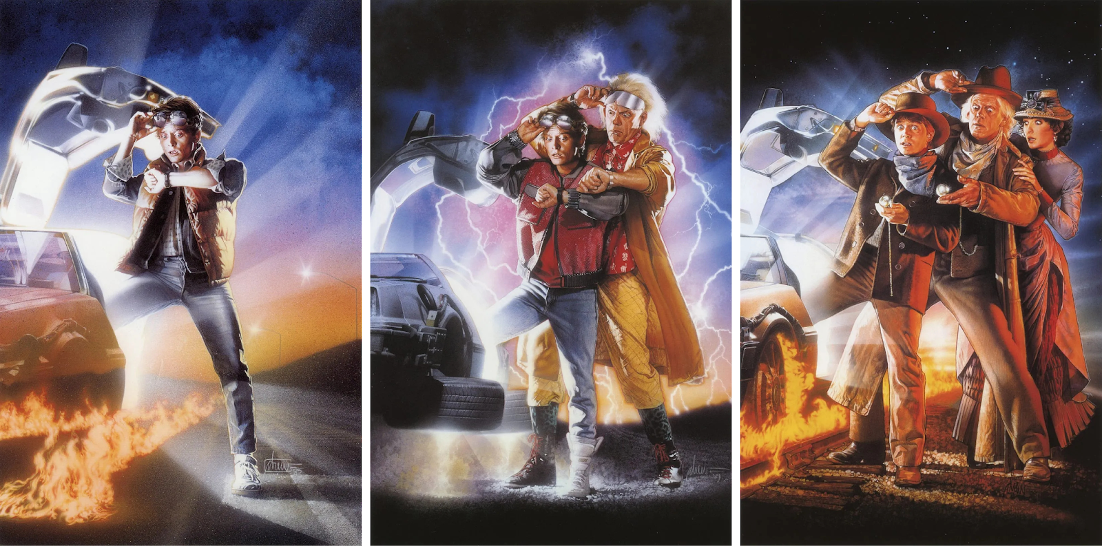
This concept is exemplified in his work for the Back to the Future trilogy, which all suggest the films’ time travel theme with Marty stepping into a glowing DeLorean and looking at his watch. The order of the films is also signified through the number of characters that appear on each poster.
“My job is to capture the spirit of the movie,” Struzan told The Hollywood Reporter. “People will see it because they want to feel that emotion. It becomes iconic when they have that feeling every time they look at the poster.”

Struzan excelled at depicting ambiguity, as shown in his poster for John Carpenter’s The Thing, the creative process of which was perhaps the most impressive of his career. The faceless man, geometric shapes, and flurry of snow convey a sense of mystery, much like the mystery of the movie itself when he was assigned this project less than 24 hours before it was due.
What made this time crunch even more difficult was that Drew wasn’t provided with any information about the film other than the fact that it was based on the 1951 movie The Thing from Another World.
“[The title] was it—that’s all I had to create with. I couldn’t show an actor or a location or anything. I couldn’t show a monster,” he explained. “I had to find a way of making nothing into something.”
This lack of specificity contributes to the unease that this poster evokes. The simplicity of the composition centres the ominous figure, while its otherworldliness is portrayed through the shards—not streams—of light that are emitting from under its hood.

Despite his disinterest in creating a summary, Drew employed a variety of storytelling techniques within each of his posters. This unreleased poster for Harry Potter and the Chamber of Secrets flawlessly depicts the character dynamics at play within the film while portraying the series’ magical elements in an intriguing and visually appealing way. With the majority of his work being promotional material, there are contractual obligations regarding the placement and size of certain actors, but he was consistently able to navigate these requirements in order to create pieces with evidently intentional compositions.
Though he occasionally returned to the industry to collaborate with friends, Struzan retired in 2008 due to the increased digitalization of movie promotion imagery. In the years leading up to this decision, his art was often reduced to limited edition or specialty posters rather than theatrical release material, much to the dismay of the directors he worked with.
“It became a disappointment to me because of the loss of work and the loss of appreciation of dealing with an artist,” he told CG Channel. “I don’t mind computers as a tool but it’s a shame it has not only changed the feeling of the world but also the [film] industry. There’s a lack of the handmade touch that people enjoy. That motivates, inspires, and transcends the page and becomes a part of people’s lives. That’s what I was trying to do all my life, that’s what I feel I accomplished in many ways.”

For Drew, retirement meant “creating art for art’s sake—it’s not for advertising movies, it’s not to explain some philosophy, this exists for itself in itself.” During this time in his studio, he made artwork of endangered animals, historical figures, his past collaborators, and channeled his ability to capture likenesses into doing portraits of his grandson Nico.
“I don't know in the history of the masters of anybody that just quit painting because they got old,” He told Slashfilm. “It doesn't happen because they know who they are and what they're doing and why they're doing it. You know, old artists never die, they just can't remember where they left their paints.”
He began doing conventions in 2017, which allowed him to meet some of the people he had been painting for decades, including Mark Hamill, Carrie Fisher, and Anthony Daniels, as well as connect with fans of his artwork.
“I had no idea that people, literally around the world were looking at my stuff and remembering it, collecting it, and enjoying it. An artists’s dream was coming true,” Drew said. “It was neat to paint it, […] the real reward is other people see it, look at it, enjoy it, and it does all those marvellous things for them, cause that really is the purpose of art. When I became attuned to the fact that it was working, that it was really helping people and making the world a better place, then I really was honoured. Finally, I feel like I had some value.”
Struzan’s nearly four decades of incredibly iconic and expressive artwork brought millions of people to movie theatres worldwide, creating lasting impact on cinema and its fans. His ability to capture entire films through a single image is a reflection of his innate skill and unique perspective on the world. He will be greatly missed.
Drew’s work, along with some personal stories and comments on each piece, can be accessed on his website.


.png)
The rich text element allows you to create and format headings, paragraphs, blockquotes, images, and video all in one place instead of having to add and format them individually. Just double-click and easily create content.
A rich text element can be used with static or dynamic content. For static content, just drop it into any page and begin editing. For dynamic content, add a rich text field to any collection and then connect a rich text element to that field in the settings panel. Voila!
"Headings, paragraphs, blockquotes, figures, images, and figure captions can all be styled after a class is added to the rich text element using the "When inside of" nested selector system."

.jpg)